5.31.2014 - 11.2.2014
Chicago Cultural Center
The party can be found at the top of the stairs of the Chicago Cultural Center. Magdalena Wistuba’s “Oscillabel” greets you with fragmented words “everywhere” and “everything” printed on little tabs of neon colored paper and dispersed throughout the Chicago DSGN logo like confetti, instantly setting the tone for an exhibition celebrating Chicago’s leading contemporary designers.

The fun continues once you enter the gallery space. A three foot wide, teardrop-shaped net is suspended over a black folding table. It’s bulging with still more brightly colored pieces of paper that look as if they might be remnants from Wistuba’s installation. The colorful spectrum repeats on the floor tiles inscribed with “You Are Beautiful.” These works by Matthew Hoffman and You Are Beautiful Inc., respectively, contrast with Ania Jaworska’s “Monument for Them,” a nine foot narrow black sculpture with three vertical pillars whose more imposing shadow spells “hi,” literally welcoming you into the space.
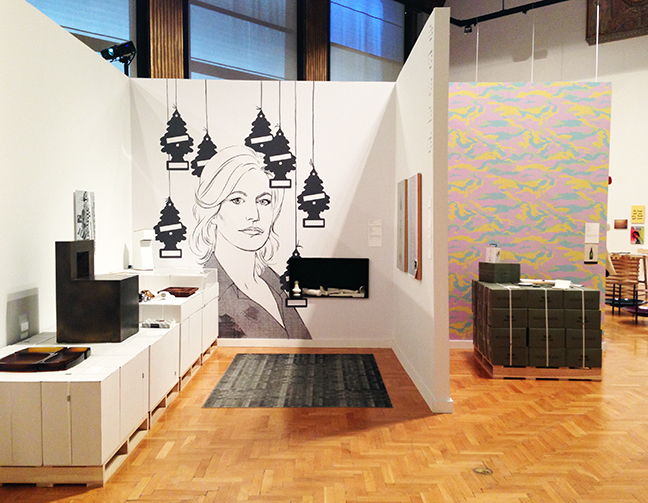
Over 100 designers are represented by a good mix of objects and text varying in size, shape and medium. With so many different designers in the show, curator Rick Valicenti does a fantastic job at giving almost every one of them a voice. All objects, with the exception of a tapestry above the introduction panel, has a wall label, most of which include a portion called “In the Designer’s Voice.” Here, designers took the opportunity to describe either the context of their work or their design approach. In a show full of purposeful design, whether it’s advertisements, branding or furniture, the insight given into the objects’ meaning gives us greater appreciation for the final product.

The “Noun Project Projection” by Simple.Honest.Work. is a series of graphics that flashes with an associated word in the corner of the projection. Though I figured out what most of the symbols are trying to convey without looking at the specific word, when I read the words first, they did not always correlate with the image on the screen. More importantly, I didn’t understand the overall concept or purpose of what I was looking at. Reading the “In the Designer’s Voice” helped me understand. The text explained there are variances in written and spoken language, however symbols may be universally understood. The group’s goal is to “build a silent (global) language that speaks louder than words.”
Returning to Ania Jaworska, her “Voice” gives commentary to monuments and landmarks as signs of “cultural momentous.” Jaworska’s piece illustrates the power of meaning prescribed to sculpture depending on community, site and time. She strips these away from her “Monument for Them,” leaving a satirical account especially poignant in Chicago where many sculptural landmarks have become synonymous with the city’s identity. Perhaps it’s no coincidence that Valicenti places Jaworska’s work at the forefront of the show.
Valicenti himself is one of the leading designers in Chicago. Examples from his firm Thirst’s work are littered throughout the exhibition. Beyond my visual excitement from the colorful walls, prints and product, I found it increasingly difficult to ignore these bits of self-promotion. Valicenti’s own impact on the Chicago design community goes unquestioned, though I began to wonder what the qualifications and motives, if any, were of the selection committee for the 200+ pieces in the exhibition.
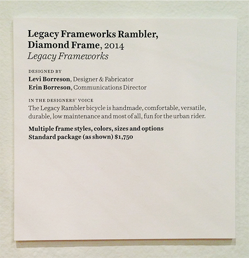
Further fueling my suspicions is the blatant price tag on the Legacy Framework piece. The “Voice” for this bicycle reads like a merchandise catalog: “This Legacy Framework bicycle is a handmade, comfortable, versatile, durable, low maintenance and most of all, fun for the urban rider,” with the starting price, printed in bold, given as $1,750. The display of this bike appears on the opposite wall of the Divvy bicycle with no mention of the membership fee; instead, the wall label focuses on the creation of the logo and its relation to bike lanes.
Other product juxtapositions highlight consumers, the main clients to these designers. Furniture giant Holly Hunt has several pieces in the show, all of which politely inform you in italics that you may “Contact showroom for price and availability: hollyhunt.com.”
Whether products are being advertised or not, there is a rawness to the custom displays they rest upon. Designed by Tim Parsons, these displays out of Styrofoam, wood and metal 2x4s, shipping pallets and stacked white cardboard boxes are a stark contrast to the refined objects adorning them.


One of the more honed displays is a ten foot table cleverly crafted of stacked square posts strewn with literature parallels the shorter wall anchored by Emerson’s words “Books are the best things well used, abused, among the worst.” I am left to assume the lack of signage and the scattered metal counter stools designed by Hale Industrial Design are a subtle invitation to use the seemingly random collection that included a book on gargoyles, a Portrait of Murdock Pemberton and a pamphlet of the School of Rock Brand Story. This is juxtaposed with abused Casey Lurie Studio’s “Primo Shelving System” that holds books and other objects that I was sternly told not to touch.


Displaying a multitude of products is challenging. The physical layout of the exhibition attempts to organize the pieces in more intimate groupings. However the repetition of these cubicles with the bombardment of advertising makes the exhibition feel more like a tradeshow. All of the colors and text begin to blur from all the overstimulation –which can only mean that the party is over.
*This review was originally posted on September 28, 2014.*